
Responsive Web Design
Coldshower Design started creating websites nearly 15 years ago. Obviously, much has changed since we cranked out our first custom web design way back when. Today, every site that we build is designed to be responsive to different devices. We have clients that ask for websites that ‘work’ on different devices, and we say THAT’S HOW WE DO IT!

So, what is responsive design? According to Wikipedia:
“Responsive web design (RWD) is an approach to web design aimed at crafting sites to provide an optimal viewing experience—easy reading and navigation with a minimum of resizing, panning, and scrolling—across a wide range of devices (from desktop computer monitors to mobile phones).”
The way we describe responsive design in normal talk is like this: The website will adapt to the viewing device. So, the content will re-arrange to the user’s screen size.
Why does responsive design matter?
“Day by day, the number of devices, platforms, and browsers that need to work with your site grows. Responsive web design represents a fundamental shift in how we’ll build websites for the decade to come.”
– Jeffrey Veen
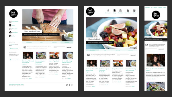
The image above is a good example of how content can be re-arranged for optimal viewing on different devices. The important thing to remember when considering web design in the mix is that the web design elements do not change, though the layout does re-arrange. Overall, the look and feel is consistent with the same colors, padding, colors and fonts integrated into the design.
Responsive web design does require more time and thought than the websites of yester-year, because now we essentially build several versions of one website: for desktop, for tablet and for phones. Each version needs an equal amount of thought and attention to ensure the most important content and tools are prevalent and easy to find within the layout.
There are handfulls of different responsive design frameworks to choose from, like Webflow, Bootstrap from Twitter, Foundation, Skeleton, and many others. We like Bootstrap, and use it a bunch. Here are some examples of responsive websites that Coldshower has built recently:
Leave a Reply
You must be logged in to post a comment.
Recent Comments